NXM

NXM

The future of smart cars is here

Sometimes we get to work with technology that’s so inspiring, it reminds us just how exciting the future can be. NXM, a dynamic and quickly-growing start-up, has developed the tech to transform almost any car into a smart car and we partnered with them to craft the branding, UX, and design for the app that brings this revolutionary technology to drivers everywhere. Our early-stage work has helped them secure key funding and acceptance into industry-leading accelerator programs — pivotal milestones in the growth of a start-up.
  • Year 2018
  • Roles
    • Brand Identity
    • Logo Development
    • Art Direction
    • User Experience Design
    • Visual Design
    • Interactive Strategy
    • Prototyping
15

App

Your car, from the palm of your hand

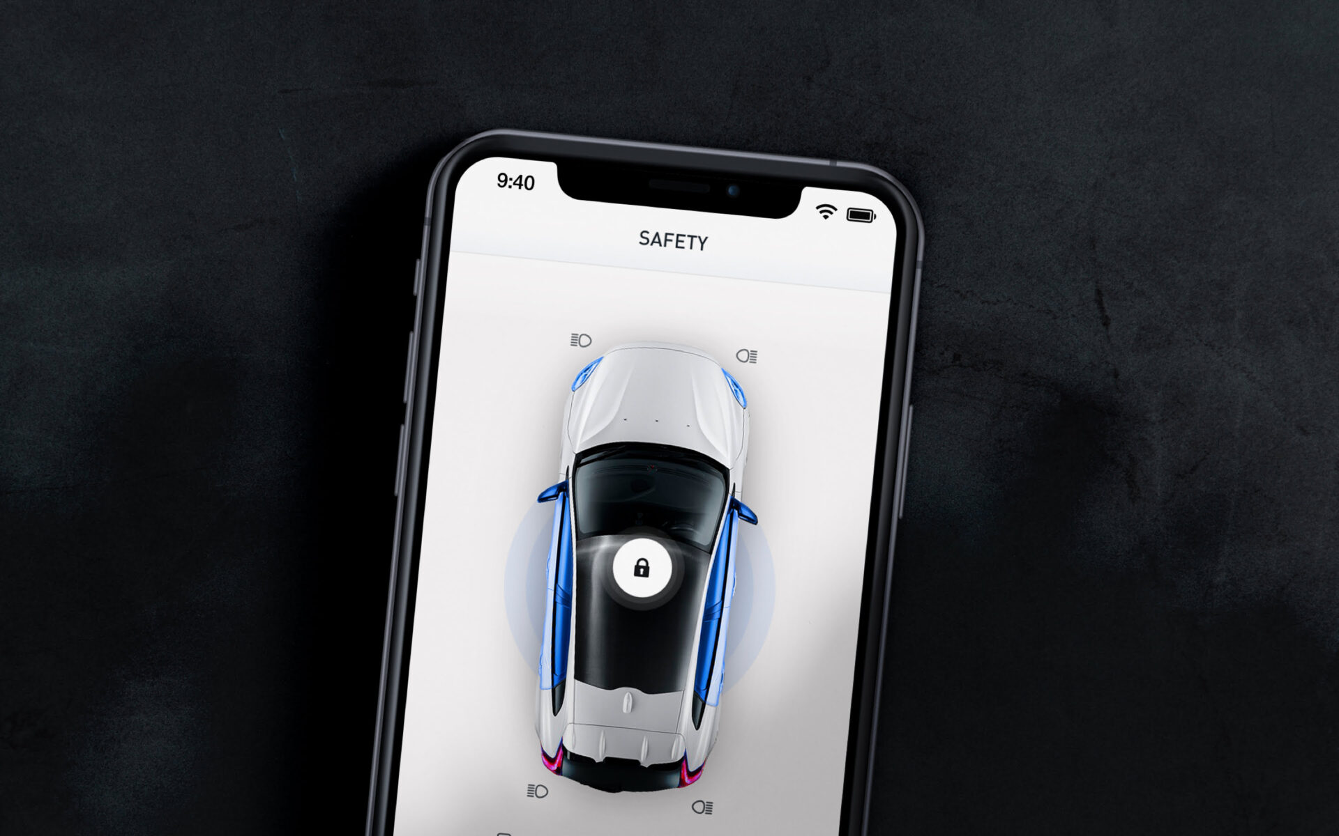
While the newest luxury models come with corresponding apps, the majority of cars on the road today do not. The NXM app levels the playing field by making smart features like remote start, trip tracking, and real-time diagnostics available to everyone. With dozens of valuable tools and notifications, our design approach was underpinned by the need to deliver a streamlined experience wrapped in a clean and polished user interface. This app marks a dramatic shift in the way customers interact with their cars and needed to resonate with new users right from their first interaction.

NXM App on Mobile Device
35

Vehicle Scan

A virtual look under the hood

With each boot-up, the NXM app conducts an instant diagnostic test, performing scans across the car as it checks for issues with the engine, battery, tires, emissions, and more. We developed a guided walk-through that allows users to review the process as it unfolds, before being presented with relevant notifications and then connected with their car.

45

Design System

Bringing the brand to life

Beyond the development of their app, we also overhauled the NXM brand, creating a more contemporary design system that communicates the organization’s core values of agility, innovation, and connection. We updated the logo, color palette, and typography, while designing a unique family of icons to illustrate the broad range of features within the app.

Clean and clear

A future-focused brand calls for a confident look, and we chose the modern classic DIN to achieve it. Known for its intentionally industrial style —more engineered than designed—it manages to stand out as bold while still feeling approachable and most importantly, legible.

  • DIN Medium

    DIN Medium

    DIN Medium Usage Example
  • DIN Regular

    DIN Regular

    DIN Regular Usage Example
55

User Interface

More than skin deep

Great user interfaces step beyond first appearances, and our approach to UI design considered the opportunities to help users easily grasp the depth and breadth of the app’s features. We designed an interface with sharp visual contrasts between features and functions, and utilized a diverse assortment of graphic elements to create a modern environment that felt both responsive and innovative.

NXM App UI Elements